The problem
New plant owners often lack the knowledge and confidence to care for their plants, leading to confusion, inconsistent routines, and unhealthy plants.
Planterra is a mobile app concept designed to help plant owners care for their collections with confidence while connecting plant lovers in a supportive community. Built as my senior capstone project, this app blends guided plant care, reminders, and social sharing into a calm, intuitive interface meant for users of all experience levels.
View final product ↓New plant owners often lack the knowledge and confidence to care for their plants, leading to confusion, inconsistent routines, and unhealthy plants.
This personal project was inspired by the surge in houseplant ownership during the pandemic. As more people brought nature indoors, I noticed many first-time plant owners struggled to keep their plants healthy. As an avid gardener, I wanted to explore why this was happening and how design could help make plant care more approachable.
Before beginning the design process, I spent 3–5 months researching houseplants, their owners, the plant industry, and potential users. This research uncovered why people were struggling and gave me the insights needed to design meaningful solutions. From there, I tested my proposed ideas through in-person research, including card sorting and user surveys. Whenever a solution missed the mark, I held in-depth conversations to uncover what I was overlooking, then refined and retested until the fit the needs of the user.
COMPETITOR ANALYSIS
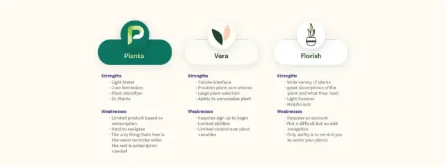
Doing competitive research allowed me to gain insights into the Plant Care industry and determine strengths and weaknesses of competitors. By doing this research I saw a lack of personal connection in the user experience. At this step, I determined what features would set me apart from others while giving an effective experience.
RESULTS
The results of the market research showed the type of people who were struggling to take care of plants and the problems they were experiencing. Once the market is established then I did some research into competitors who were currently addressing those problems and what they could possibly be missing.
USER RESEARCH
The user survey was a questionnaire distributed to over 100 individuals. The questions were carefully developed by backtracking from what I truly wanted to understand—how users interact with plant care, what influences their purchasing decisions, and what they need to care for plants successfully. The insights gathered from this research were instrumental in shaping tools that enhance the overall user experience.
CARD SORTING
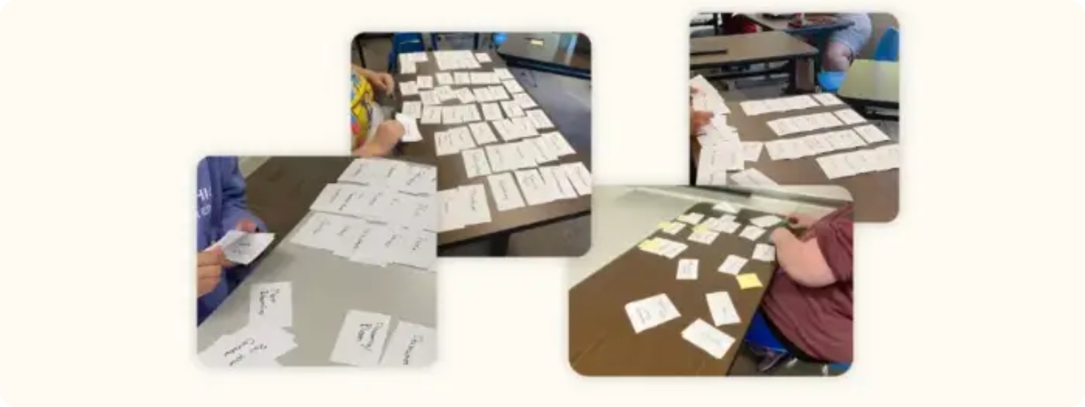
Card sorting helps the analysis phase of UI/UX design by revealing how users naturally group and label information, allowing designers to create a more intuitive structure and navigation system that aligns with user expectations.
EMPATHY MAPPING
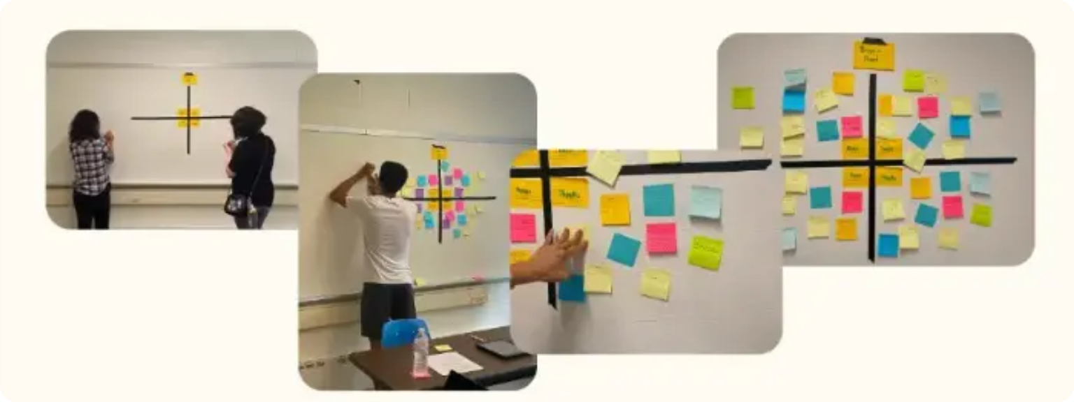
Empathy mapping gave me vital information about the concerns, questions, feelings, and overall enjoyment people would experience towards the subject of plant care. Being able to talk and experience others emotional connection with plant care, whether good or bad, allowed me to visualize what areas of plant care to target.
PERSONAS
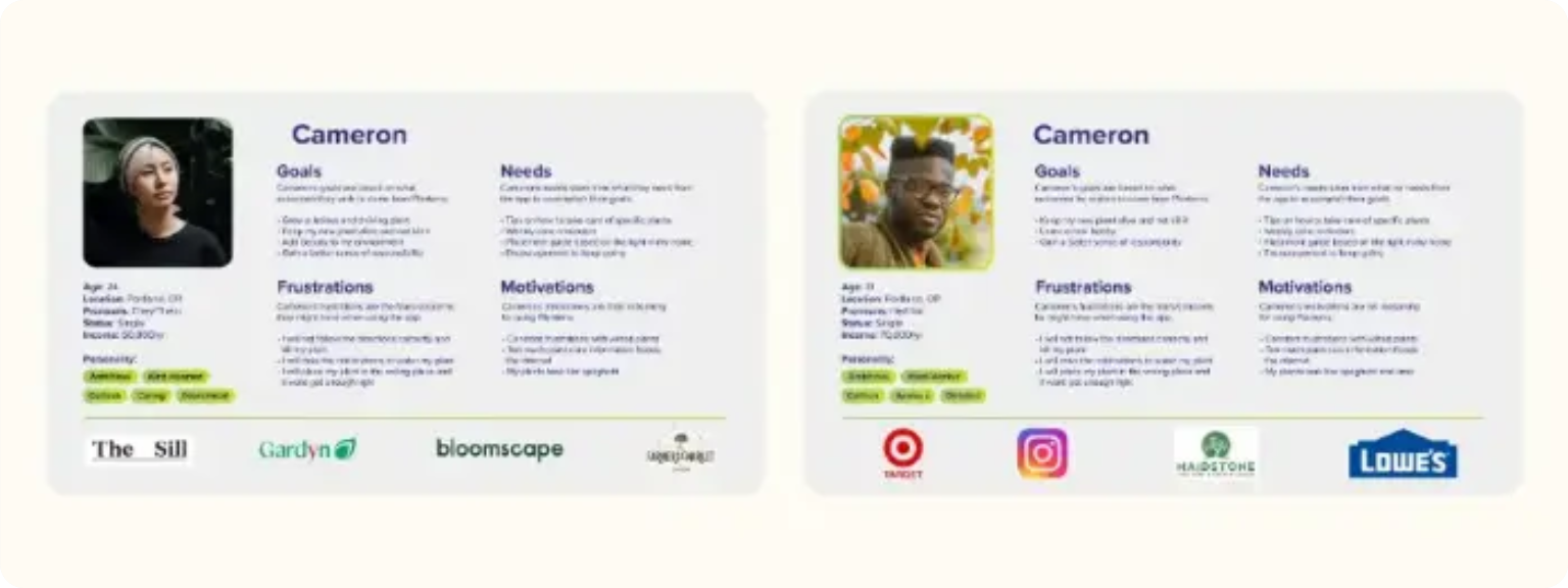
User personas are shaped from all the previous research methods and answers. These personas are more acute than the provisionals and allowed me to determine more information of the motivations and needs of the users. Personas provided crucial insight into what type of person will be using my app and how I can aid them in accomplishing their goals.
PRODUCT ROADMAPPING
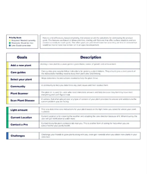
Created detailed product maps to visualize features, workflows, and interactions, ensuring a cohesive design that aligns with both user needs and business goals.
USER JOURNEY
Mapped the end-to-end user journey to identify pain points, highlight key touch points, and uncover opportunities for a smoother, more engaging experience.
*Designing without understanding users risks creating a product no one wants or can use.
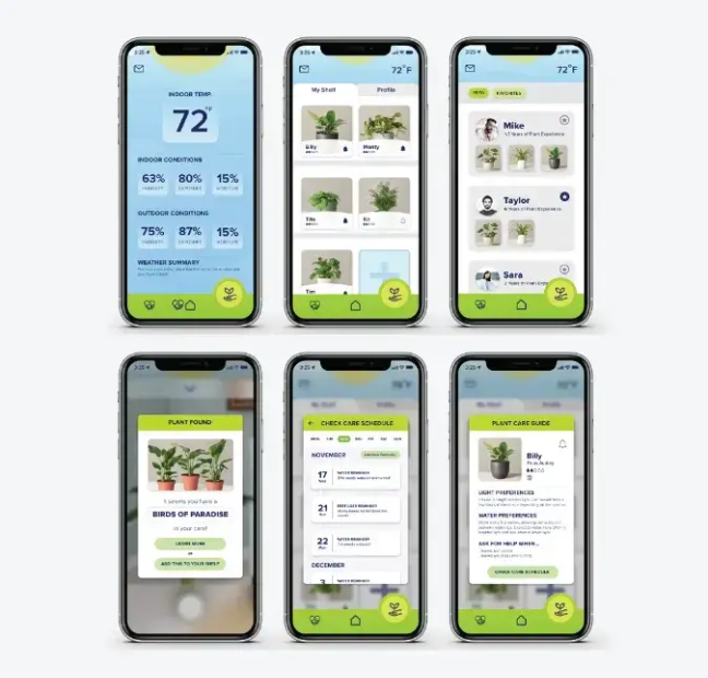
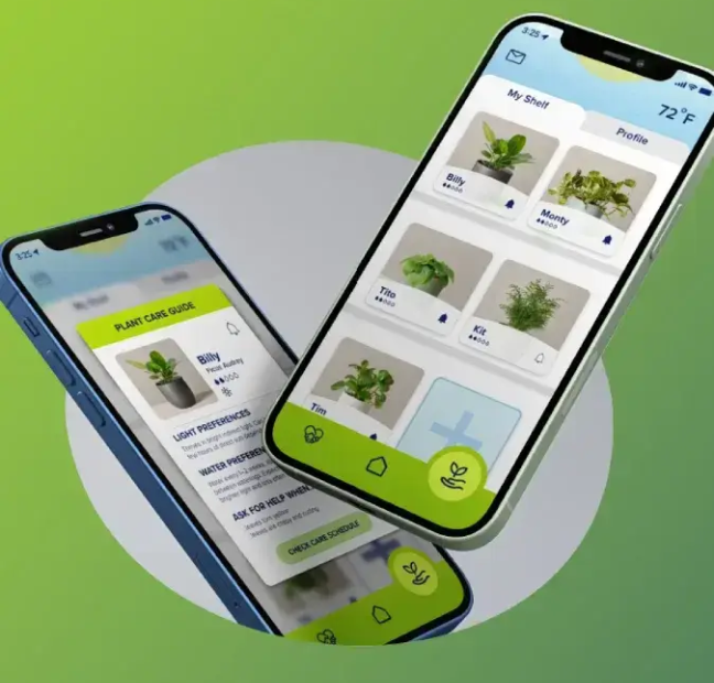
After compiling the research, my solution was Planterra. This is an application that would solve the problem of people killing their houseplants while also providing a helpful and friendly community of plant people. The main functions of the application are the plant identification (camera authenticator), library (guide of all plants with helpful information), doctor (for houseplant diseases and on-demand help), as well as a community of other plant lovers whom you would be able to connect with to trade, view their shelf, and get helpful information.
I identify the features that matter most, remove unnecessary complexity, and prioritize functionality to create a more purposeful user experience.
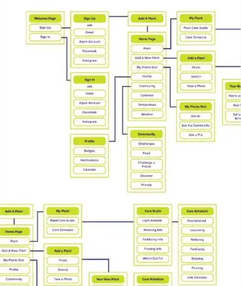
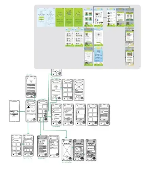
Research is translated into a clear user experience through site maps, user flows, and wireframes. This process organizes content, reduces friction, and creates an intuitive path for users.
This is where the experience begins to take shape. Wireframes define layout, hierarchy, and user flow, while early interaction patterns help reduce friction and create a more intuitive experience.
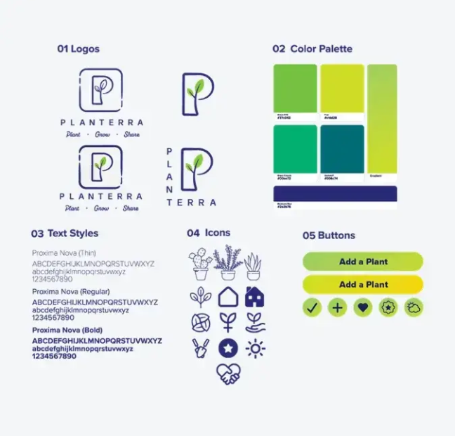
I establish a design system that unifies typography, color, spacing, and reusable components, ensuring a consistent and efficient experience across every screen.
Placeholder takeaway — a lesson that shows how you think.
Placeholder takeaway — something you would do differently.
Placeholder takeaway — what you carried into the next project.