Skip to the story
Case Study 07 — Event Marketing

Cosmos

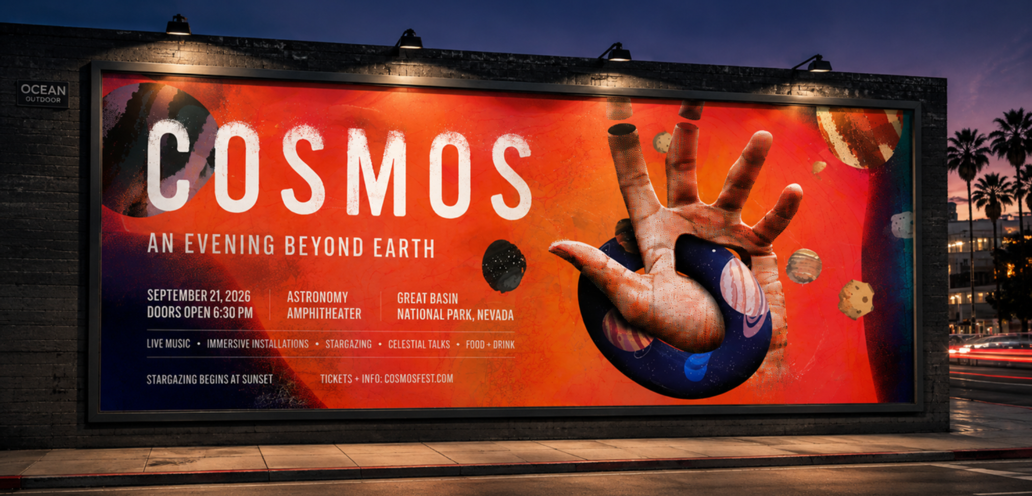
A speculative event identity that transforms an astronomy festival into a contemporary brand experience through expressive visuals, editorial typography, and a campaign system designed to scale across print, digital, environmental, and experiential touchpoints.

View final product ↓
Client
Cosmos
Industry
Science & Tech
Role
Designer
Timeline
2021

The problem

Most astronomy events rely on literal imagery and educational branding that struggles to create excitement beyond science enthusiasts. The challenge was to develop an identity that made astronomy feel immersive, emotional, and culturally relevant while encouraging a broader audience to experience the night sky.
Background & goals

COSMOS is a self initiated concept exploring how visual identity can transform an astronomy event into a cultural experience. Rather than positioning space as something distant and scientific, the project reimagines it as something artistic, tactile, and emotionally engaging.

  1. 01Create a memorable event identity that stands apart from traditional science branding.
  2. 02Balance scientific credibility with expressive visual storytelling.
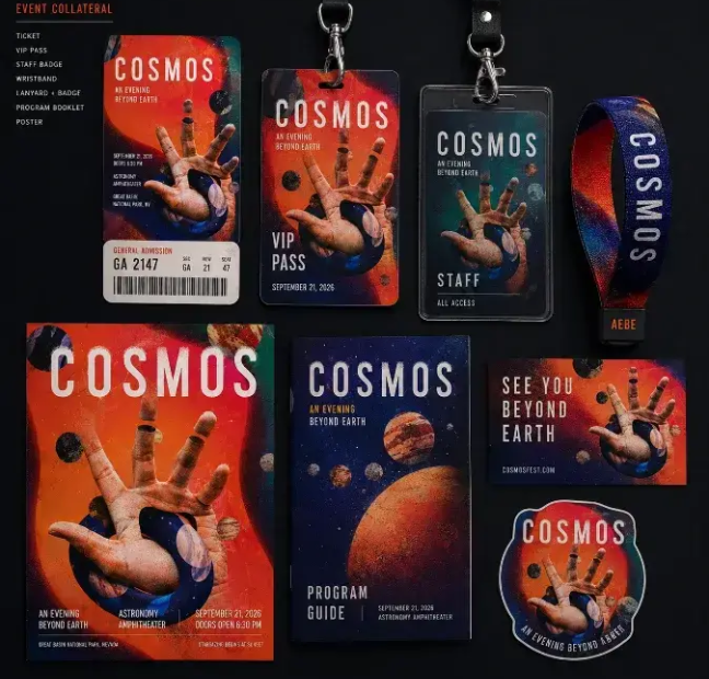
  3. 03Develop a flexible design system capable of extending across print, digital, environmental graphics, motion, and event collateral.
  4. 04Build an identity that feels premium enough for a contemporary arts festival while remaining accessible to a general audience.

Research → strategy

Rather than beginning with aesthetics, I explored how astronomy organizations, museums, music festivals, and immersive art experiences communicate wonder. Many astronomy events leaned heavily on photography and educational graphics, while music festivals often prioritized energy over storytelling.

The opportunity was to bridge those two worlds.

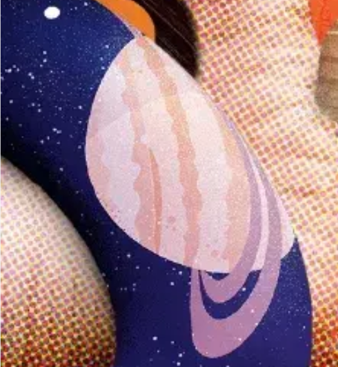
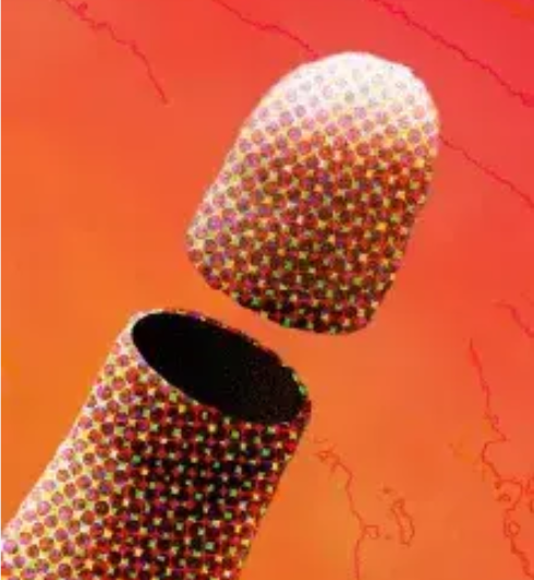
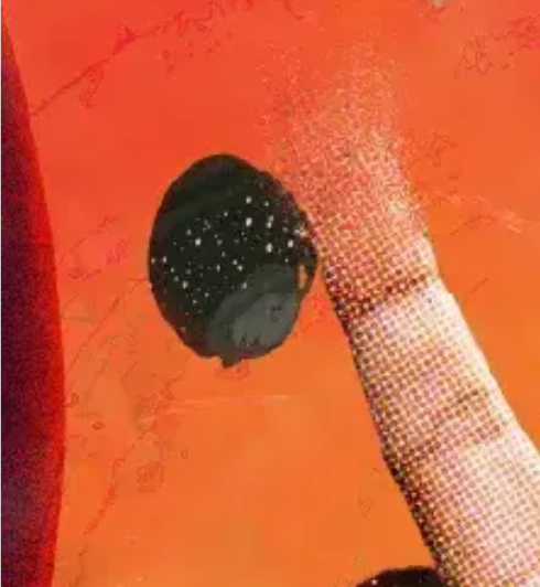
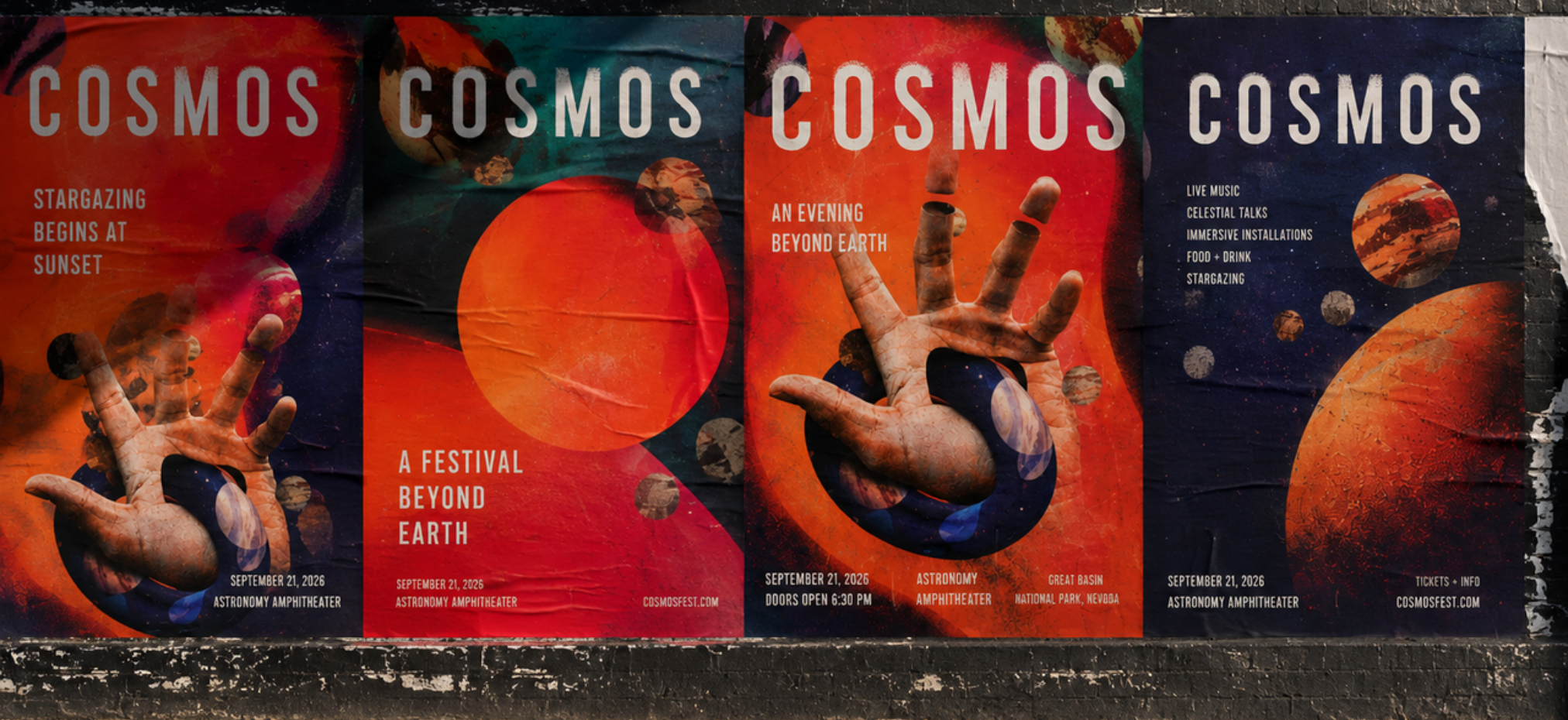
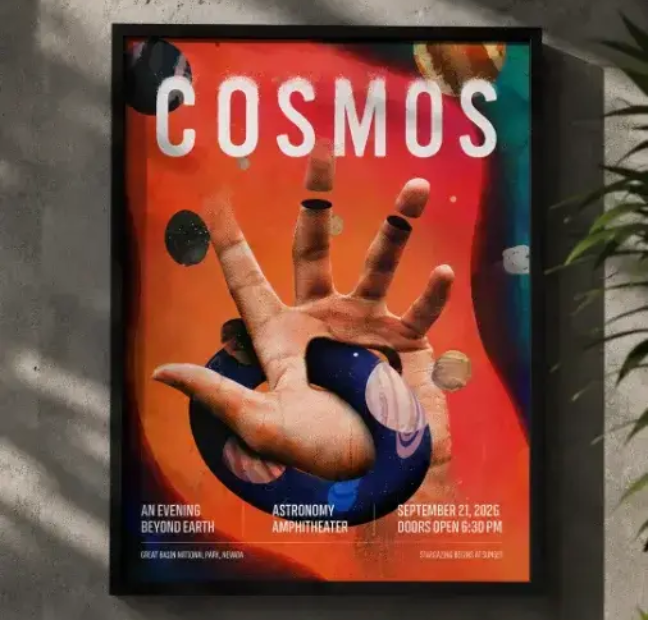
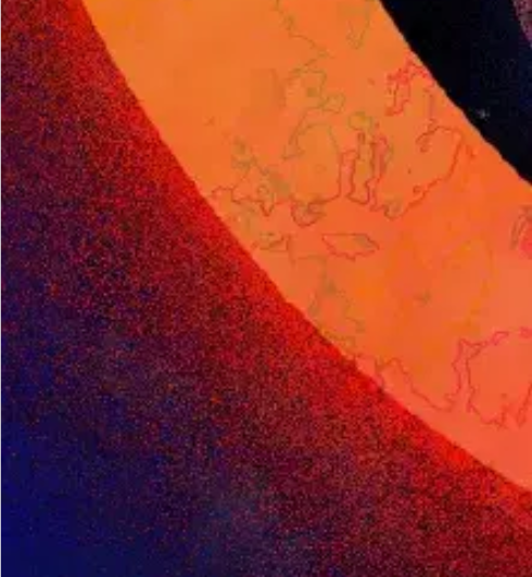
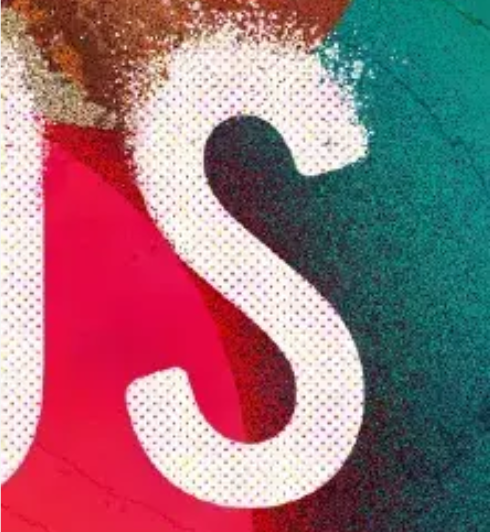
The visual strategy centered on making space feel tangible instead of distant. Organic textures, fragmented forms, halftone treatments, and saturated color create a sense of movement and discovery, while bold typography provides structure and legibility across every application. This balance allows the identity to feel expressive without sacrificing clarity.

Process

01
Research & Discovery

Researching visual territory, audience, and cultural references to define an identity that balanced scientific credibility with artistic expression.

02
Visual Exploration

Experimenting with typography, composition, texture, and color to establish a distinctive creative direction.

03
System Design

Developing a flexible visual language that could extend consistently across print, digital, environmental, and motion applications.

04
Campaign Rollout

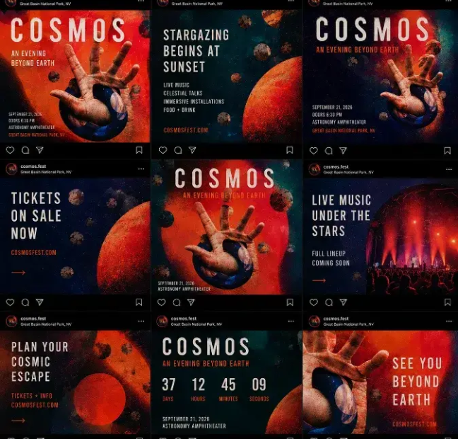
Applying the identity across multiple touchpoints to demonstrate how the system adapts while maintaining recognition and cohesion.

DETAILS

COLOR + GRAIN
TYPOGRAPHY
PLANET ILLUSTRATIONS
HALFTONE
COSMIC ELEMENTS
TEXTURE

The solution

Key takeaways

01WONDER

Create a sense of curiosity through scale, surreal imagery, and unexpected compositions.

02CONTRAST

Balance expressive textures with clean typography to maintain clarity across every medium.

03EXPANSION

Build a flexible identity system capable of adapting from posters and social content to environmental graphics, motion, and merchandise.