Skip to the story
Case Study 04 — Website, Visitor Guide & Design System

Discover Santa Clara

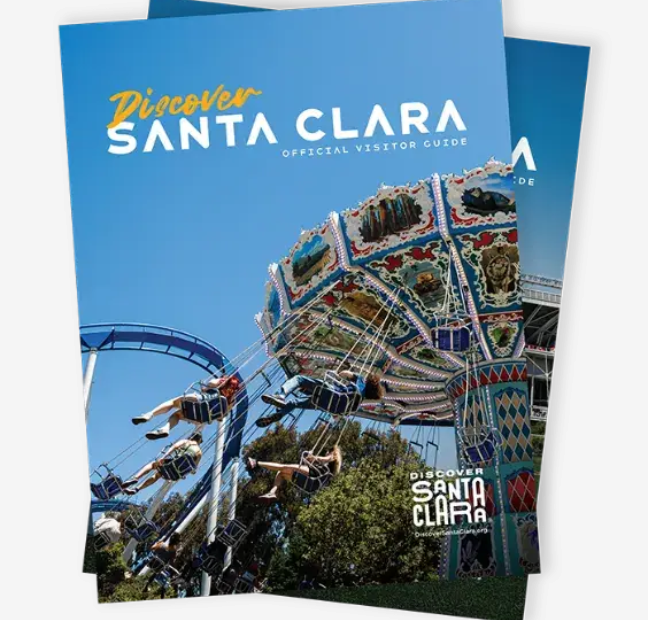
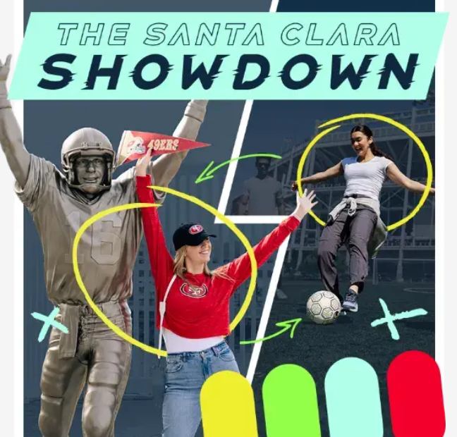
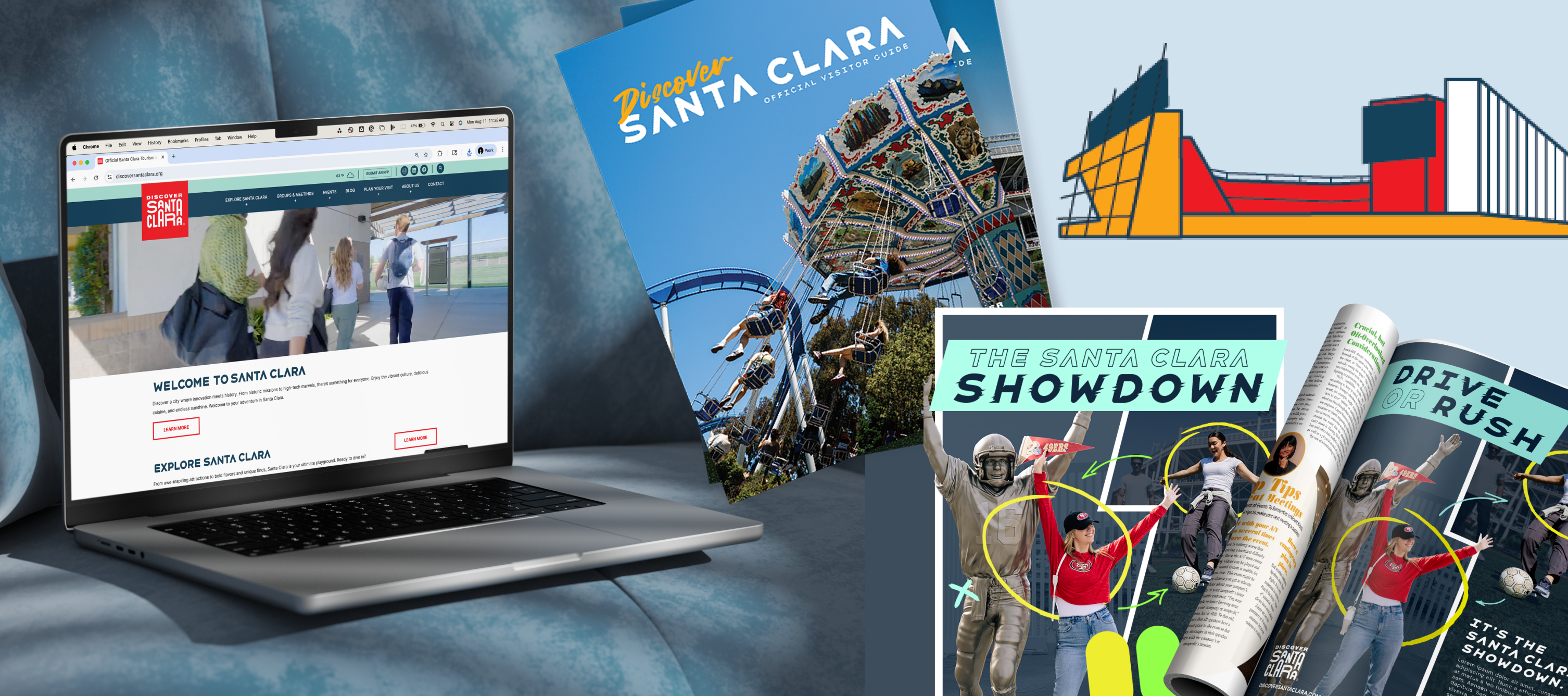
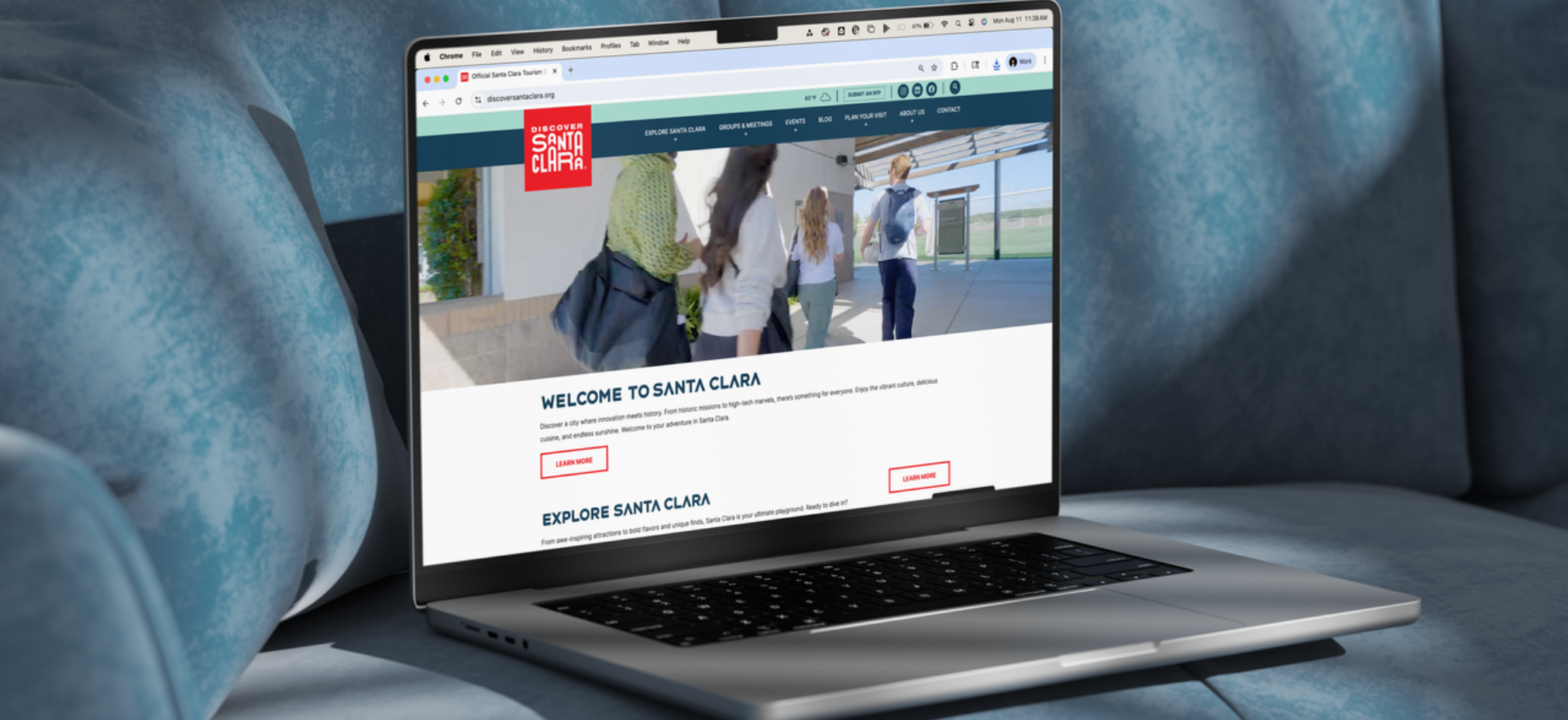
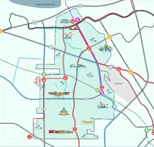
I expanded an existing destination brand into a cohesive visual system that could scale across multiple touchpoints. By creating new graphic elements, layouts, and supporting assets, I applied the brand across its first visitor guide, a website redesign, and a sports tourism campaign, ensuring each experience felt consistent while serving different audiences.

View final product ↓
Client
Discover Santa Clara
Industry
Travel
Role
Designer
Timeline
2024

The problem

The destination's visual identity was still evolving and needed to support a growing range of marketing initiatives. While the foundation of the brand existed, it lacked the flexibility and supporting design system needed to translate consistently across editorial, digital, and campaign work.
Background & goals

As the destination expanded its marketing efforts, I worked alongside the Design Director to evolve the visual language into a more complete brand system. My role focused on designing new assets, layouts, and graphic treatments that could be applied across multiple mediums while remaining recognizable and aligned with the established identity.

  1. 01Expand the existing brand into a scalable visual system.
  2. 02Create consistency across print, digital, and campaign applications.
  3. 03Develop flexible design elements that could support future marketing initiatives.

Research → strategy

Before creating new assets, I evaluated the existing identity to understand which visual characteristics made the brand recognizable and where opportunities existed to expand it. Rather than introducing unrelated styles, I focused on building complementary design elements that strengthened the established foundation.

 I considered how each application would be experienced differently. Editorial layouts needed to support long form storytelling, the website required intuitive navigation and stronger visual hierarchy, and the sports campaign called for a more energetic expression of the same identity. This approach allowed the brand to adapt to different audiences while maintaining a consistent visual language across every touchpoint.

Process

01
Audit & Stakeholder Interviews

I reviewed the existing brand identity, met with stakeholders to understand long term goals, and identified opportunities to expand the visual language while preserving the brand's strongest characteristics.

02
Brand Expansion

I developed new graphic elements, layout principles, and supporting assets that extended the existing identity into a more flexible design system capable of adapting across future marketing efforts.

03
System build

I translated the expanded brand into real world applications by designing the destination's first visitor guide and adapting the same visual language for a responsive website redesign, ensuring consistency across print and digital.

04
Press checks & handoff

I refined layouts, prepared production ready files, and continued evolving the visual system as it expanded into a sports tourism campaign, ensuring every new application felt like part of the same cohesive brand.

Wireframes & structure

Design iterations — what changed and why

V1 — Placeholder. What was wrong with the first attempt.
V2 — Placeholder. What improved and what still failed.
V3 — Shipped. Placeholder: why this one worked.

The solution

View website View guide

Key takeaways

01

Placeholder takeaway — a lesson that shows how you think.

02

Placeholder takeaway — something you would do differently.

03

Placeholder takeaway — what you carried into the next project.